Landing Page Design Rules That Actually Drive Conversions

A landing page is a single-purpose page built to earn one conversion, whether that’s a sale, a signup, or a booked call. The rule that matters most: match your headline to whatever the visitor just clicked, and show exactly one primary call-to-action above the fold. Skip this, and every other design decision is just decoration.
Here’s the benchmark to calibrate against:
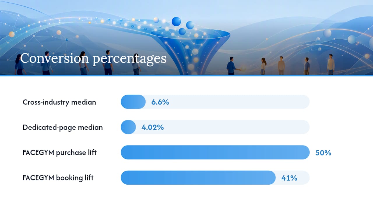
- Cross-industry landing pages convert at a median of 6.6%, according to Unbounce data.
- LanderLab’s 2026 analysis puts the median dedicated landing page closer to 4.02%.
Check message match first. It’s the highest-leverage fix on the list.
Key Takeaways
A landing page converts when its headline matches the visitor’s intent, its CTA stays singular, and friction gets removed from the form before the button.
| Point | Details |
|---|---|
| Message match comes first | Fix headline alignment with your ad or link before testing anything else. |
| One CTA, repeated | Show the same action above the fold and again after your proof section. |
| Benchmark your rate | Compare against the 6.6% cross-industry median or 4.02% dedicated-page median. |
| Cut form fields | Fewer fields consistently outperform longer forms on low-commitment offers. |
| Vertical Brands delivers proof | Its landing-page work drove FACEGYM’s 50% purchase increase and 41% booking rise. |
Table of Contents
- Landing Page Design Examples Worth Copying in 2026
- What Makes a Landing Page Convert?
- How Do You Design a Landing Page That Converts?
- Which Tools and Templates Should You Use?
- What Happened When Vertical Redesigned FACEGYM’s Landing Pages?
- Landing Page Best Practices Checklist
- How Should You Test and Measure a Landing Page?
- Sources
Landing Page Design Examples Worth Copying in 2026
You don’t need to reinvent anything. The patterns below already work, and each one earns its place for a specific reason.
- Short-form email capture. One headline, one field, one button. It converts because there’s nothing to think about beyond “yes” or “no.”
- SaaS free-trial hero. A single email field paired with a bold “Start Free Trial” button removes the friction that kills signups before they start.
- E-commerce promo page. A bold, contrasting CTA button paired with a scarcity cue (“only 12 left”) pushes hesitant buyers toward the checkout.
- Webinar or lead-gen long-form page. These work when they stack a clear agenda, speaker credibility, and a countdown timer in that order, not scrambled together.
A few micro-patterns show up across nearly all of these:
- Hero layouts that put the value proposition left, image right (or a full-bleed video background).
- CTA buttons in a color that contrasts hard against the page palette, never blending into the brand scheme.
- Testimonials placed right next to the form, not buried in a footer nobody scrolls to.
Short looped video in the hero can lift comprehension fast without overloading the visitor, and Wyzowl data cited alongside landing-page research shows video increases understanding by roughly 74%.
What Makes a Landing Page Convert?
Five traits separate high-converting pages from the ones that quietly bleed traffic. FormAssembly’s roundup of high-converting examples breaks it down clearly, and the pattern holds across industries.
- A specific headline. Vague benefits lose to concrete ones. “Save 40% on your first order” beats “Great deals await.”
- One CTA, repeated. Not five competing buttons. The same action, stated the same way, at the top and again after the proof section.
- Visual hierarchy and whitespace. Mobile-first layouts that don’t cram five ideas into one screen.
- Trust signals above the fold. A review count, a client logo, a security badge, something.
- Frictionless forms. Every field you cut is a field someone didn’t have to abandon halfway through.
The 6.6% benchmark: that’s the median conversion rate across industries tracked by Unbounce. Landing pages missing two or more of the traits above tend to sit well under that line.
Removing unnecessary form fields is one of the most consistently documented levers in LanderLab’s best-practices guide: shorter forms routinely outperform longer ones on low-commitment offers, sometimes by a wide margin.
How Do You Design a Landing Page That Converts?
Build in this order, and don’t skip steps to get to the fun part faster.
- Define the conversion goal and audience segment. One goal per page. A page trying to sell and collect newsletter signups does neither well.
- Write the headline and subhead first. One line stating the benefit, one line explaining how you deliver it. HubSpot’s landing page guidance recommends stripping site navigation entirely on paid-traffic pages so the headline has no competition for attention.
- Design the hero. Image or video on one side, CTA button visible without scrolling, visual hierarchy that draws the eye toward the button naturally.
- Build the form with minimal fields. Use conditional logic or progressive profiling if you genuinely need more data later, but don’t front-load every question on day one.
- Run the pre-launch checklist. Analytics tracking wired to a thank-you page event, mobile QA on at least two screen sizes, a speed test, and a basic accessibility pass (contrast ratios, alt text, keyboard navigation).
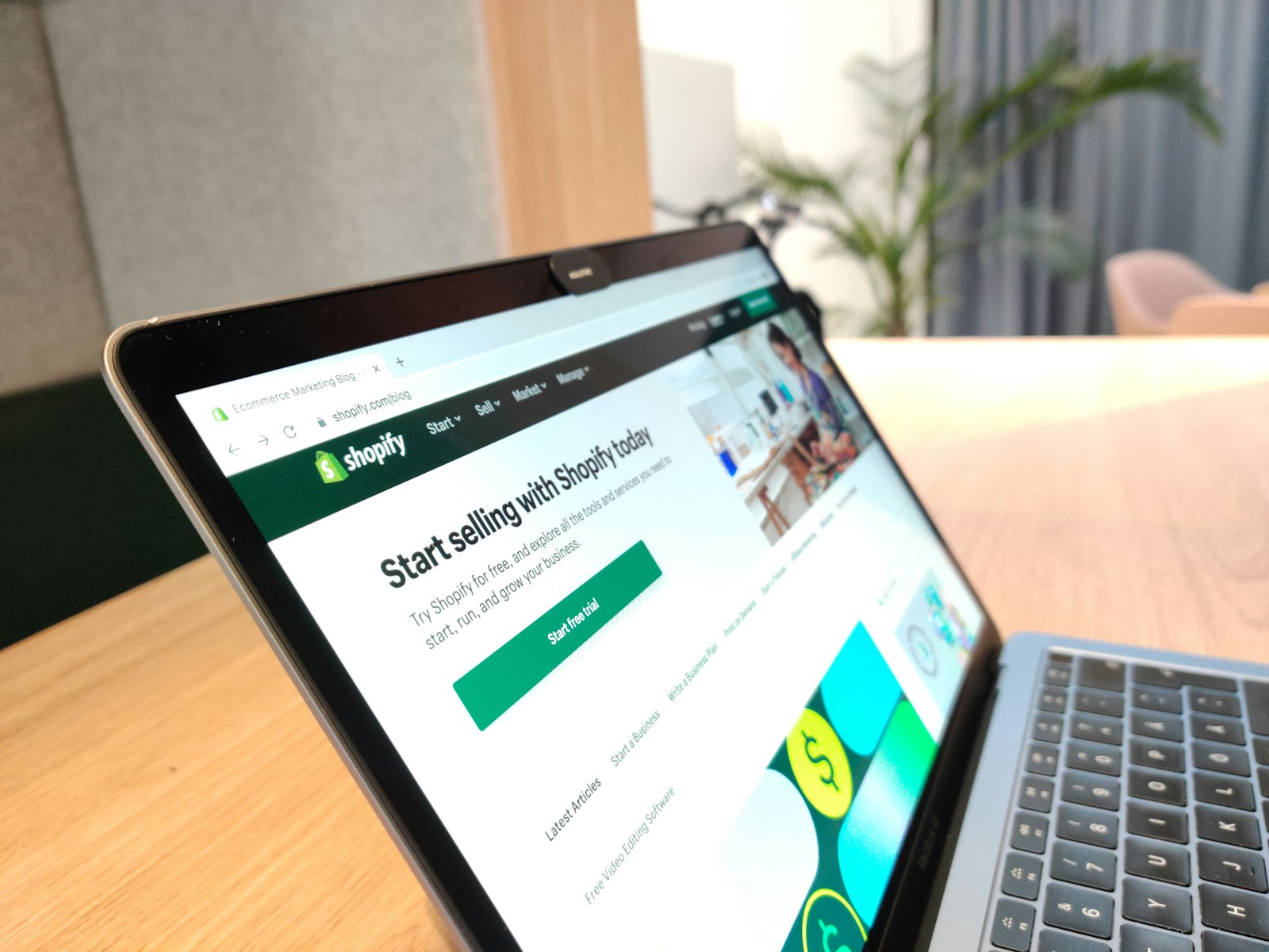
Shopify’s guide to high-converting pages frames this as three pillars: relevance, clarity, and trust. Every step above maps to one of the three. Skip the checklist and you’re guessing at what broke when the numbers come in low.
Which Tools and Templates Should You Use?
Match the tool to your timeline, not your ambition.
- Quick launch: if you need a page live this week, a drag-and-drop builder with a mobile-first template gets you there without a developer. Look for templates with minimal third-party scripts. Every script is a speed tax.
- Custom-coded performance: if the page needs to handle heavy traffic or match a specific brand system pixel-for-pixel, custom code usually wins on load speed and long-term flexibility.
- Asset guidance: compress every image before upload, lazy-load anything below the fold, and keep demo videos short and looped rather than long-form.
- When to bring in a developer or agency: once the page needs custom tracking, complex conditional forms, or has to integrate with a CRM, DIY tools start costing more time than they save.
For copy specifically, resources like SemLocal’s blog and guides on persuasive copywriting offer practical frameworks worth borrowing from.
What Happened When Vertical Redesigned FACEGYM’s Landing Pages?
FACEGYM needed more than a fresh coat of paint. It needed pages built around the traits described above: message match, one clear CTA, trust signals placed where hesitant buyers actually look.
After Vertical Brands applied its landing-page and marketing optimizations, FACEGYM saw a 50% increase in purchases and a 41% rise in bookings.
The levers behind that shift:
- Headlines rewritten to match the exact ad copy driving the click.
- A single, repeated CTA instead of multiple competing buttons.
- Trust signals (reviews, credibility markers) moved above the fold.
- Ongoing testing rather than a one-time launch and walk away.
Landing Page Best Practices Checklist
Run this before you call any page finished.
Do:
- Match the headline to the ad or link that brought the visitor there.
- Lead with the benefit, not the feature.
- Remove site navigation on paid-traffic pages.
- Test the headline before you test anything else.
Don’t:
- Ask for information you don’t need yet.
- Show two CTAs that compete for the same click.
- Ignore mobile load time. It’s often the first thing that kills conversion.
Run a contrast check on your CTA button and a basic accessibility scan (alt text, keyboard tab order) before launch.
How Should You Test and Measure a Landing Page?
- Track conversion rate against the page’s single stated goal. That’s your primary KPI, full stop.
- Test in this order: message match first, then form length, then CTA placement, then imagery. Shopify’s testing guidance and LanderLab’s staged approach both point to headline and message-match tests moving the needle fastest.
- Don’t call a test early. Wait for enough traffic to reach statistical confidence before switching a version off.
- Wire tracking from the CTA event through to the thank-you page, and connect it to your CRM so attribution doesn’t break at the handoff. Tools like those covered in CRM automation guides can help close that loop.
A Strategic Reminder on Landing Page Pitfalls
The biggest failures we see aren’t design failures. They’re alignment failures, where creative teams and analytics teams never talk. Over-designed heroes, mismatched messaging, and forms nobody stress-tested for friction all trace back to that gap. Fix the alignment first.
Vertical Brands Turns Landing Page Guesswork Into Measured Growth
Reading about message match and CTA placement is one thing. Having a team that builds, tests, and rebuilds your page until the numbers move is another. Vertical Brands runs strategy, creative, and web development under one roof, so your landing page isn’t handed between three vendors who never compare notes.
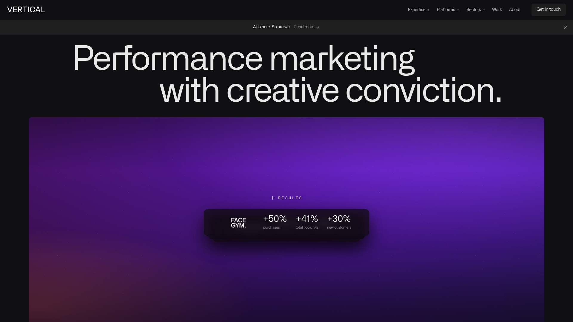
That’s the gap most solo builders and small teams hit: they can design a decent-looking page, but they don’t have the testing rigor to know why it isn’t converting. Vertical Brands applied exactly this approach for FACEGYM, producing a 50% increase in purchases and a 41% rise in bookings. If your landing page needs that same combination of message match, trust signals, and structured testing, book a consultation with Vertical Brands and get a second set of eyes on what’s holding your conversion rate back.
Sources
- 20 High-Converting Landing Page Examples (and Why They Work) — FormAssembly
- Landing page best practices — HubSpot
- Landing Page Best Practices: The Complete 2026 Guide — LanderLab
- High-Converting Landing Pages: Best Practices + Core Pillars — Shopify
Recommended

Other posts


































Stay ahead with better decisions.
Get business insights today.
