35% Sales Lift: Checkout Optimization Roadmap for Ecommerce Owners

The highest-impact move in checkout optimization is cutting cognitive load: strip the flow down to what’s necessary, show the full price before payment, and let customers pay with a tap. Guest checkout prominence, upfront cost transparency, and digital wallets like Apple Pay and Google Pay solve most of the friction that causes abandonment. The rest of this guide breaks these tactics into a checklist, a prioritized roadmap, and a testing plan so you know exactly where to start.
TL;DR:
- Prioritize reducing form fields to around 12 and support autofill to lower friction and improve completion rates.
- Make guest checkout prominent and default, preventing account creation from causing unnecessary cart abandonment.
- Show total costs, including shipping and taxes, before the final payment step to prevent surprises that lead to drop-offs.
- Support digital wallets like Apple Pay, Google Pay, and PayPal early in the checkout process to cater to mobile users and increase conversion.
- Focus on fixing high-impact, low-effort issues first, such as validation errors and payment failures, before pursuing larger redesigns or speed enhancements.
Table of Contents
- A checklist for fixing the checkout flow that’s losing you sales
- Which checkout fixes to prioritize first
- How to measure and test checkout changes properly
- What real checkout fixes have delivered for other brands
- What happens after the customer clicks “buy” also matters
- Where checkout optimization efforts usually go wrong
- Where Vertical fits into your checkout optimization plan
- Sources
- FAQ
A checklist for fixing the checkout flow that’s losing you sales
Most checkout problems come from the same handful of causes, and most of them are fixable without a rebuild. Baymard Institute’s checkout research found that 64% of desktop sites and 63% of mobile sites rate “mediocre” or worse on checkout usability, and that design changes alone could lift conversion by as much as 35% on an average large site. That gap is the opportunity.
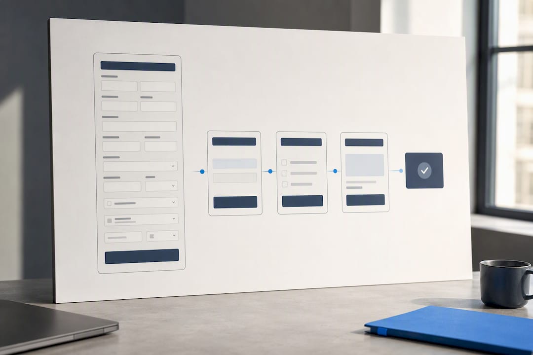
Simplify the flow first. Baymard’s research points to a reduced number of form elements as an ideal checkout target, yet most sites display considerably more. Every extra field, every unnecessary click, and every ambiguous label adds friction that customers notice even when they can’t name it. Group related fields, remove anything you don’t need for fulfillment, and use progress indicators so shoppers know how many steps remain. A one-page checkout crammed with fields can feel harder than a clean three-step flow, so judge the design by how simple it feels, not by how many pages it spans.
Make guest checkout the default, not an option buried under account creation. Baymard’s abandonment research found that forced account creation causes roughly 19% of cart abandonment, and that 62% of sites still fail to make guest checkout prominent. Push account creation to after the purchase, when the customer already has a reason to save their details.
Treat mobile as the primary experience, not an afterthought. Reduce taps, use large touch targets, and enable autofill so returning customers barely have to type. Digital wallets matter even more here: Apple Pay conversion data shows a 121% lift on mobile compared with manual card entry, and digital wallets now account for about 40% of UK e-commerce spending, ahead of both credit and debit cards. If your checkout doesn’t support Apple Pay, Google Pay, or PayPal, you’re asking mobile shoppers to do the one thing they’re least willing to do on a small screen: type a card number.
Show payment options early and handle failures without punishing the customer. Displaying accepted payment methods before checkout begins sets expectations and can prevent last-minute exits. When a payment fails, keep the cart and entered details intact and give a specific reason rather than a generic error.
Surface the full cost before the final step. Unexpected shipping fees and taxes are one of the most common reasons carts get abandoned. Show estimated delivery dates instead of vague shipping speeds, display order cutoff countdowns for same-day or next-day delivery, and total everything, shipping and tax included, in the cart rather than saving it for a surprise at payment.
Fix form usability issues that quietly kill completion rates. Support browser autofill, use adaptive validation that flags errors as the customer types rather than after submission, and mark fields as optional rather than making every field feel mandatory. Hide rarely needed fields like a second address line behind a link instead of showing them by default.
Build trust without slowing anyone down. Visible SSL indicators, a clear returns policy, and easy access to support (live chat or a visible phone number) reassure hesitant buyers at the exact moment they’re deciding whether to trust you with their card.
- Reduce visible form fields toward Baymard’s benchmark of around 12 elements.
- Make guest checkout the prominent, default path.
- Show digital wallets (Apple Pay, Google Pay, PayPal) as payment options from the first screen.
- Total shipping, tax, and fees in the cart before the final step.
- Use adaptive validation and mark optional fields clearly.
Pro Tip: Audit your checkout on a phone before touching a desktop, since most abandonment now happens on mobile screens where every extra tap counts double.
Performance matters here too. A slow-loading checkout page compounds every other problem on this list, since customers who are already annoyed by friction have less patience for lag. Our guide to ecommerce site speed covers the specific fixes that tend to move checkout completion the most.
Which checkout fixes to prioritize first
Not every fix on the checklist above deserves the same attention right now. Ranking changes by impact against effort tells you where to start and what to schedule for later.
Guest checkout prominence, surfacing total costs in the cart, and fixing your top three validation errors are high-impact, low-effort wins. None of them require a platform migration, and each addresses a documented cause of abandonment. These belong in the first sprint.
Payment integrations (adding Apple Pay, Google Pay, or PayPal), a full checkout flow redesign, and page speed improvements sit in the medium-to-high effort category. They pay off, but they need development time, testing, and sometimes a vendor integration, so they belong on a roadmap rather than a to-do list for this week.
A practical sequence looks like this:
- Audit current checkout analytics to find the exact step where customers drop off and which fields generate the most errors.
- Ship the quick wins: make guest checkout the default, total all costs in the cart, and fix the highest-error form fields.
- Add or reposition digital wallets so they appear before the customer reaches manual card entry.
- Redesign the flow around Baymard’s reduced-field benchmark if the audit shows the form itself is the bottleneck.
- Tackle page speed and mobile performance as a parallel project, since gains here compound with every other fix.
Set simple acceptance criteria for each change before you ship it. A guest checkout change should show a measurable drop in account-creation-stage abandonment. A cost-transparency change should reduce exits at the shipping or payment step specifically, not just move the abandonment further down the funnel.
How to measure and test checkout changes properly
Checkout optimization only works when you can prove a change helped. Before running anything, decide what you’re tracking and how you’ll know a variant won.
Track checkout conversion rate as your primary metric, alongside step completion rate, payment failure rate, and average order value. A change that lifts conversion but drops average order value isn’t necessarily a win.
Instrument these events at minimum:
- Cart viewed and checkout started, to calculate your baseline abandonment rate.
- Field-level error events, so you know which inputs cause the most friction.
- Payment attempted versus payment succeeded, to isolate failures caused by your payment provider rather than your form.
- Step-by-step progression through the checkout, to find the exact drop-off point.
When you run an A/B test, give it enough traffic and time to reach statistical significance before drawing conclusions, and segment results by device, since mobile and desktop shoppers often respond differently to the same change. Set a guardrail metric, like refund rate or support ticket volume, so a “winning” variant isn’t quietly causing problems elsewhere. Once a variant beats the control with confidence, move it into production and keep the losing version documented for reference rather than testing it again later.
What real checkout fixes have delivered for other brands
Checkout changes work when they’re prioritized correctly and tested rather than guessed at.
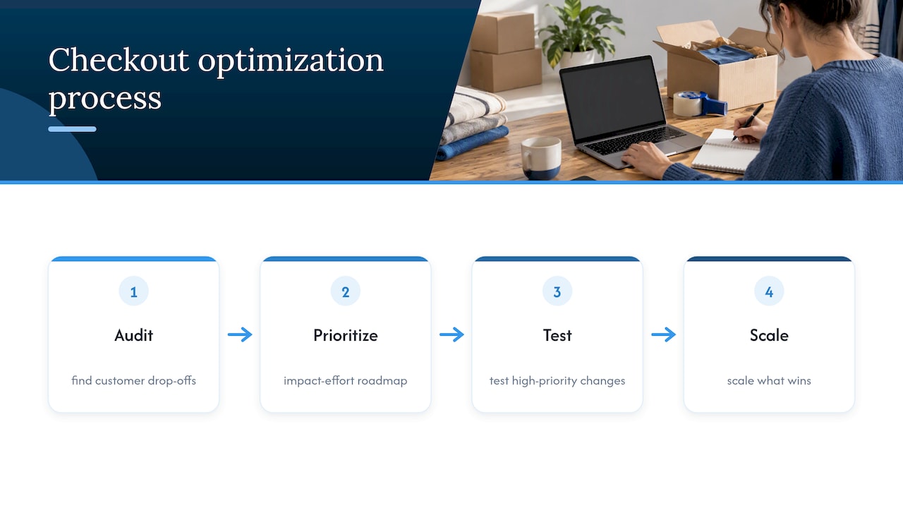
Vertical’s approach to this kind of work follows a consistent pattern: audit the existing checkout to find where customers actually drop off, build a prioritized roadmap based on impact and effort, test the highest-priority changes, and scale what wins. Teams handling this in-house can follow the same shape: instrument your analytics first, fix the highest-impact low-effort items, test everything else before committing engineering time to it, and revisit the roadmap quarterly as your traffic and product mix change.
What happens after the customer clicks “buy” also matters
Checkout optimization doesn’t end at the confirmation screen. A clear, well-timed confirmation page and email reduce a specific kind of anxiety: the customer wants proof the order went through and a sense of when it will arrive. Include the order number, an estimated delivery date, and a visible way to contact support if something looks wrong.
This moment is also a low-friction opportunity, not just a formality. A single relevant upsell or cross-sell on the confirmation page, kept simple and easy to skip, can lift average order value without adding any friction to the purchase itself. Avoid stacking multiple offers here, since the goal is reassurance first and revenue second.
Post-purchase messaging matters just as much. A short survey asking why the customer chose to buy, or what almost stopped them, gives you direct evidence for your next round of checkout fixes rather than guesses. Our guide on turning post-purchase surveys into revenue covers how to structure that feedback loop. For customers who abandon before completing the purchase, a well-timed recovery email fills the gap our guide to abandoned cart emails walks through in detail.
Where checkout optimization efforts usually go wrong
The most persistent myth in checkout optimization is that fewer steps automatically means higher conversion. It’s not the number of steps that drives abandonment, it’s how complicated each step feels. A single page crammed with fifteen visible fields can feel far harder than a clean three-step flow with progress indicators, because perceived effort matters more than step count.
The second common mistake is misplaced priority. Teams spend weeks polishing button colors and animations while a broken validation message or a shipping cost that appears out of nowhere at the last step quietly drains conversion every day. Fix the things that generate errors and surprises before you touch the things that only affect appearance.
If your team has the time and the analytics skills to run this process well, iterate in-house. If checkout conversion has plateaued and nobody has the bandwidth to audit, test, and sequence changes properly, that’s the point where bringing in outside help tends to pay for itself faster than continuing to guess.
*— Alex
Where Vertical fits into your checkout optimization plan
An agency that works across strategy, creative, performance marketing, and web development can perform a checkout audit without delays waiting on separate teams. The same team that finds friction may build the fix and track whether it worked.

If your checkout conversion has stalled and you want a clear, sequenced plan rather than a long list of untested ideas, explore Vertical’s services to start with an audit and a prioritized roadmap built around your own data.
Sources
For deeper detail, Baymard Institute’s checkout UX research covers usability benchmarks in full, and its cart abandonment analysis breaks down specific causes with supporting data. For payment trends, see the Apple Pay adoption statistics. For broader ecommerce design context, this ecommerce web design guide is a useful companion.
- Checkout UX Best Practices 2025 – Baymard Institute
- Apple Pay statistics (Worldpay / 2026 report coverage)
FAQ
Is 12% conversion rate on a website good?
Conversion rates vary widely by industry, price point, and traffic source, so there’s no single number that applies to every site. Rather than comparing to an outside benchmark, track your own checkout conversion rate over time and after each change, since that trend tells you more than a single snapshot.
How to improve checkout process?
Start by reducing the number of visible form fields, since Baymard’s research points to around 12 as an ideal target, and make guest checkout the default path rather than an afterthought. Add digital wallets like Apple Pay and Google Pay, and show the full cost, including shipping and tax, before the final payment step.
Is SEO worth it for eCommerce?
Search engine optimization drives the traffic that checkout optimization then needs to convert, so the two work together rather than competing for priority. A well-optimized checkout won’t help much if too few visitors reach the product page in the first place.
What does “checkout” mean?
Checkout is the sequence of steps a customer completes to pay for items in their cart, typically including shipping details, payment information, and order confirmation. It’s the final and most sensitive stage of the buying process, where small friction points have an outsized effect on whether the sale completes.
Recommended

Other posts
































































Stay ahead with better decisions.
Get business insights today.
