3 Experiment First Pricing Page Tests for Product Teams (FACEGYM Case)

Pricing page optimization works fastest when you prioritize three things: clarify the value of each plan, limit buyers to a few tiers, and surface one recommended option with a CTA that cannot be missed. These changes consistently matter more than minor color or font adjustments. Once they are in place, structured testing tells you what to refine next.
TL;DR:
- Most effective pricing pages limit options to three or four tiers, with one clearly marked as recommended based on actual usage data.
- Visual hierarchy, including size and contrast, should prioritize the recommended plan and key decision-making features, not color alone.
- Real-time metrics like conversion rate, bounce rate, and scroll depth are crucial to measure before changing the design or copy.
- Transparent pricing details, including billing cadence and trial terms, are legally required in many markets and improve trust.
- Segmenting visitors and personalizing default options or messaging can improve conversions, but only if the core structure is clear and consistent.
Table of Contents
- Why Pricing Pages Matter and What to Measure
- Pricing Page Fundamentals: Clarity, Differentiation, and Choice
- Pricing Display Strategies: Layout, Anchoring, and Toggles
- Design and UX Rules That Reduce Decision Friction
- Social Proof and Objection Handling Near the Price
- Mobile and Accessibility Adjustments That Protect Conversion
- A Practical Testing and Analytics Roadmap
- A Practitioner’s View on What Actually Moves the Needle
- Legal and Compliance Considerations for Pricing Transparency
- Updating Pricing Pages for Different Segments and Behavior
- Where Most Teams Go Wrong on Pricing Pages
- How Vertical Can Help You Optimize Your Pricing Page
- FAQ
- Sources
Why Pricing Pages Matter and What to Measure
The pricing page is where intent becomes a decision. Visitors arrive here after they have already compared you to alternatives, so friction at this stage carries an outsized cost. Design and clarity at the pricing table stage matter because most visitors have already done their research by the time they reach price. A confusing table at this point can undo everything that brought them there.
Measuring this page correctly means watching more than page views. Four metrics tell you whether the page is doing its job: conversion rate from visit to signup or purchase, bounce rate specific to the pricing page, time on page as a proxy for confusion or careful comparison, and revenue per visitor once plan mix is factored in.
Instrument these events before you touch the design:
- CTA clicks, broken out by tier, so you know which plan draws interest.
- Plan selection or toggle interactions, including monthly versus annual choices.
- Trial starts or checkout initiations tied to the specific plan selected.
- Scroll depth on the pricing table to flag where attention drops off.
- GA4 goals or equivalent events for each step between page view and purchase.
During any test, watch conversion rate first, then bounce rate and time on page as supporting signals. A change that raises conversion but spikes support tickets about billing confusion is not a win. It is a new problem wearing a better headline.
Pricing Page Fundamentals: Clarity, Differentiation, and Choice
A pricing page succeeds or fails on whether a visitor can tell plans apart in under ten seconds. That requires benefit-led headlines, not feature labels, and a short clarifier under each plan name that states who it is for.
- Write one benefit-led headline per tier, followed by a single sentence naming the buyer it fits best.
- Cap the lineup at three or four tiers. Beyond that, buyers stall rather than choose.
- Map each tier to a distinct buyer job: a solo user, a growing team, an enterprise with compliance needs.
- Use consistent phrasing like “everything in [previous tier], plus” so buyers understand tiers build on each other rather than compete.
- Name tiers consistently across the whole site, including emails and in-app upgrade prompts, so nothing feels like a different product.
- Badge one plan as recommended, but only when usage data or customer mix genuinely supports that choice.
Design-first best practices consistently point to limiting options and giving one tier visual priority as a recurring trait of pages that convert well. The badge works because it removes a decision, not because it manipulates one. If your most common customer is actually on the entry tier, badge that one. Honesty here protects trust further down the funnel.
Pricing Display Strategies: Layout, Anchoring, and Toggles
Whether you use a table or cards depends on how much your buyer needs to compare. Dense feature sets with many line items usually call for a table, since it lets eyes scan down a single feature across all tiers. Simpler offerings, with three or four features that matter, often work better as cards, since cards foreground the decision rather than the comparison.
The good-better-best layout remains the standard for a reason: it lets a buyer self-select by ambition rather than forcing them to calculate value from scratch. Anchoring supports this when a higher tier is placed first or priced visibly above the recommended plan, making the middle option look like the sensible middle ground rather than a compromise.
A few display rules consistently hold up:
- Default the toggle to annual billing when your business model benefits from longer commitments, but always show the monthly equivalent for comparison.
- State the savings in plain terms, such as the number of months free, rather than only a percentage.
- Use a decoy tier sparingly and only when it genuinely represents a real, usable option. A decoy that offers nothing anyone would choose erodes trust once buyers notice the pattern.
- Keep price typography larger than any other number on the page so the eye lands there first.
Annual defaults paired with clear savings language tend to lift commitment length without adding confusion, provided the monthly price stays visible for anyone doing the math.
Design and UX Rules That Reduce Decision Friction
Visual hierarchy should do the thinking for the buyer before they read a word. Larger type, more whitespace, and stronger contrast around the recommended tier should pull the eye there first, every time. Never rely on color alone to signal the preferred plan: a border, a slightly larger card, or a “most popular” label protects buyers who are colorblind or scanning quickly.
Feature ordering matters more than most teams assume. Put the features that actually drive a decision, like seat limits or support response times, near the top. Comparison tables work best when they focus on the differences that break ties between the plans a buyer is actually choosing between, so identical rows across every tier should be hidden behind a tooltip or accordion rather than repeated as noise.
- Order features by decision impact, not alphabetically or by internal product structure.
- Collapse identical or minor features into an expandable section.
- Use tooltips for jargon or technical specs rather than cluttering the table.
- Keep the CTA button text specific to the action, such as “Start free trial,” not a generic “Submit.”
- Repeat the CTA at the bottom of a long table so buyers who scroll do not have to scroll back up.
Pro Tip: Test your pricing table with the sound off and the page scrolled to a random point. If you cannot tell which plan is recommended within two seconds, your hierarchy needs work.
Social Proof and Objection Handling Near the Price
Trust signals work best when they sit close to the decision, not buried in a separate testimonials page. A single customer logo row or one short quote placed directly above or beside the pricing table reduces hesitation at the exact moment a buyer is deciding.
Risk reversal matters just as much as proof. A visible trial period, a money-back guarantee, or a plain sentence about when billing starts removes the quiet fear that often stalls a purchase. Clear billing cadence and transparent disclosure of what is included reduce the late-stage friction that shows up as abandoned checkouts.
- Place one short testimonial or logo strip within view of the pricing table, not below the fold.
- State trial length and cancellation terms in plain language next to the CTA.
- Add two or three inline FAQ items addressing billing, refunds, and upgrade paths directly on the page.
Nearly all buyers now expect pricing to be stated plainly before they engage further, a shift that recent Forrester commentary on business buying ties to changing expectations in how buyers research and purchase. A page that hides terms until checkout works against that expectation.
Mobile and Accessibility Adjustments That Protect Conversion
Most pricing page visits now happen on a phone, so the desktop table rarely survives the transition unchanged. Stack plans vertically as cards, collapse feature comparisons into accordions, and pin the CTA to the bottom of the screen so it travels with the scroll.
- Keep touch targets large enough to tap accurately on a small screen, with clear spacing between CTAs.
- Use body text sizes that stay legible without zooming, and check contrast ratios against background colors.
- Confirm every toggle, tooltip, and CTA is reachable and operable using keyboard navigation alone.
- Load critical CSS for the pricing table first so the page renders the price before anything else.
A pricing table that loads slowly or requires pinching to read loses buyers before they ever see the recommended plan.
A Practical Testing and Analytics Roadmap
Prioritize experiments by multiplying expected impact, your confidence in the hypothesis, and the inverse of effort required. A one-line copy change with strong supporting data beats a full redesign with a guess behind it.
- Start with low-effort, high-confidence changes: badge wording, CTA copy, and toggle defaults.
- Move to structural tests once early wins are banked: plan order, tier count, and anchor pricing.
- Run tests long enough to reach statistical significance before declaring a winner, and check results by traffic segment, not just in aggregate.
- Use heatmaps and session recordings before building a test, so the hypothesis is grounded in actual behavior rather than a guess.
| Test idea | What it changes | Primary metric |
|---|---|---|
| Recommended badge | Visual emphasis on one tier | Conversion rate |
| Toggle default | Monthly vs. annual starting state | Revenue per visitor |
| CTA copy | Button text and urgency | Click-through rate |
| Plan order | Left-to-right tier sequence | Time on page |
Behavior analytics tools that capture heatmaps and session replay help you see where buyers hesitate before you spend engineering time on a test that targets the wrong friction point.
A Practitioner’s View on What Actually Moves the Needle
Agencies that run pricing page work day to day tend to see the same pattern: clarity and a single strong recommendation outperform clever design tricks.
- Audit the current page for buyer confusion before writing new copy.
- Simplify tier count and messaging before testing visual details.
- Measure consistently so the next test builds on real evidence, not opinion.
Teams with the time and traffic to run their own structured tests can do this in-house or partner with experts offering website support and design tailored to their sector for faster implementation. Teams without a dedicated conversion function, or without the traffic volume to reach significance quickly, tend to move faster with outside help.
Legal and Compliance Considerations for Pricing Transparency
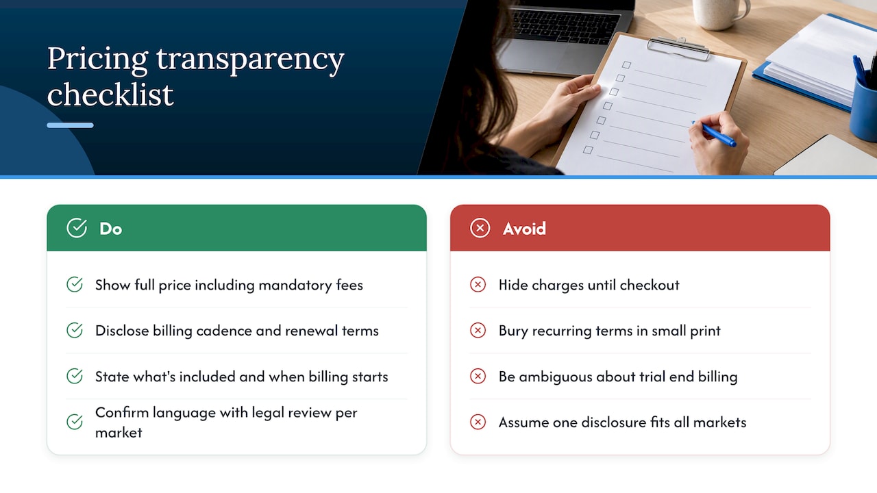
Pricing transparency is not just a conversion tactic. In many markets, consumer protection rules require that the price shown to a buyer be the full price, inclusive of mandatory fees, before they commit to a purchase. Hiding charges until checkout, or revealing a recurring billing term only in small print, creates legal exposure in addition to the trust problem it causes.
Clear disclosure of billing cadence, whether a plan renews monthly or annually, and what happens at the end of a trial period protects both the buyer and the business. Guidance on software pricing transparency recommends stating exactly what is included in a price and when billing starts, since ambiguity here is one of the most common sources of late-stage cancellations and chargebacks.
Specific rules vary by market and by product category, particularly for subscription services with automatic renewal. A business selling across multiple regions should confirm its pricing page language against the consumer protection and e-commerce rules that apply in each market it serves, since a disclosure that satisfies one jurisdiction may not satisfy another. This is a case where legal review, not a best-practice list, should have the final word.
Beyond the legal minimum, transparent pricing tends to perform better commercially as well. A buyer who feels misled by hidden fees rarely becomes a repeat customer, even if the initial purchase goes through.
Updating Pricing Pages for Different Segments and Behavior
A pricing page does not need to look identical to every visitor. Returning visitors who have already viewed the page once might see a different default toggle state, a reminder of a trial they started, or a tier pre-selected based on their prior browsing.
Segmentation can run on traffic source, company size signals, or geography, provided the underlying price and terms stay consistent and compliant. A visitor arriving from an enterprise-focused campaign might land on a page that opens with the enterprise tier expanded, while a visitor from a self-serve ad sees the entry tier first.
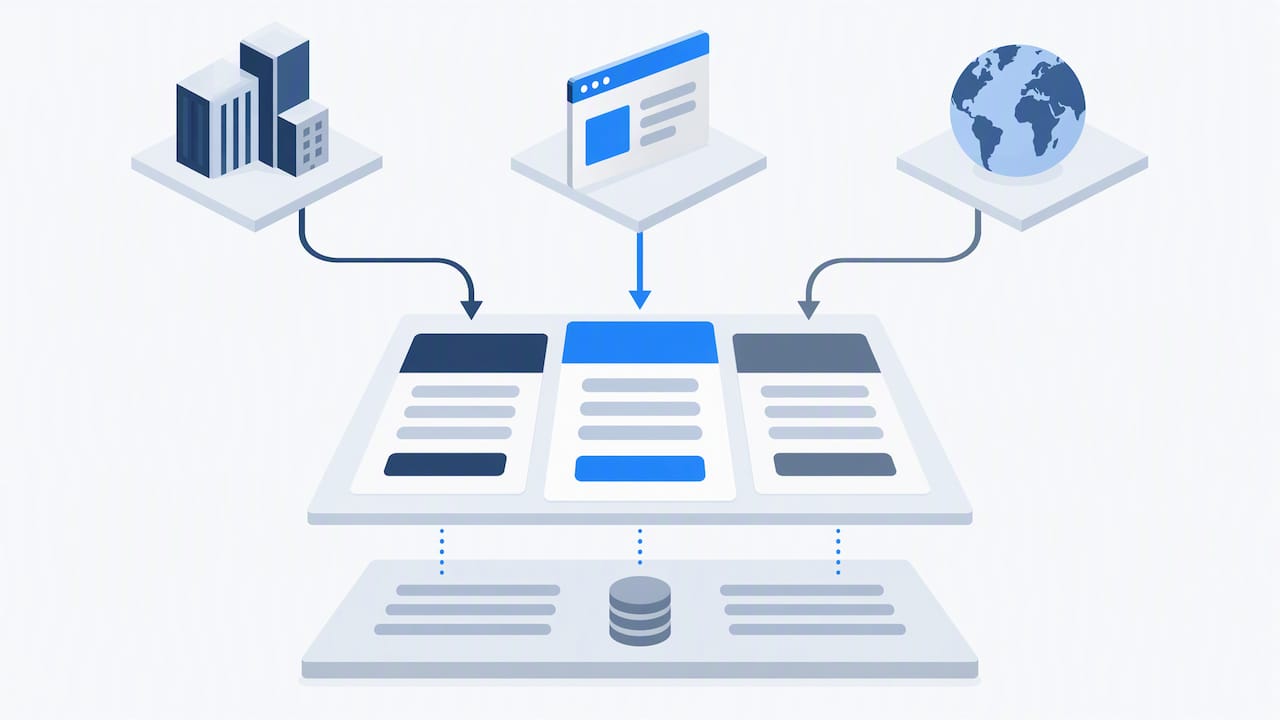
Behavioral triggers matter too. A visitor who has viewed the pricing page multiple times without converting might be a candidate for a different message, such as a direct link to a sales conversation, rather than another repeat of the same table. None of this requires rebuilding the page constantly. It requires defining a few clear rules, testing them, and letting the data decide which version earns a permanent place.
Where Most Teams Go Wrong on Pricing Pages
The biggest mistake is analysis paralysis: teams debate tier names for weeks while the actual page sits untested. A close second is running tests without instrumentation in place, so a “winning” variant cannot be explained or repeated. A third is tier overlap so heavy that buyers cannot tell what they are paying extra for.
My framework is simple: clarify the message, simplify the choice, then measure. Rebuild only when the structure itself is broken, not when a single headline underperforms.
— Alex
How Vertical Can Help You Optimize Your Pricing Page
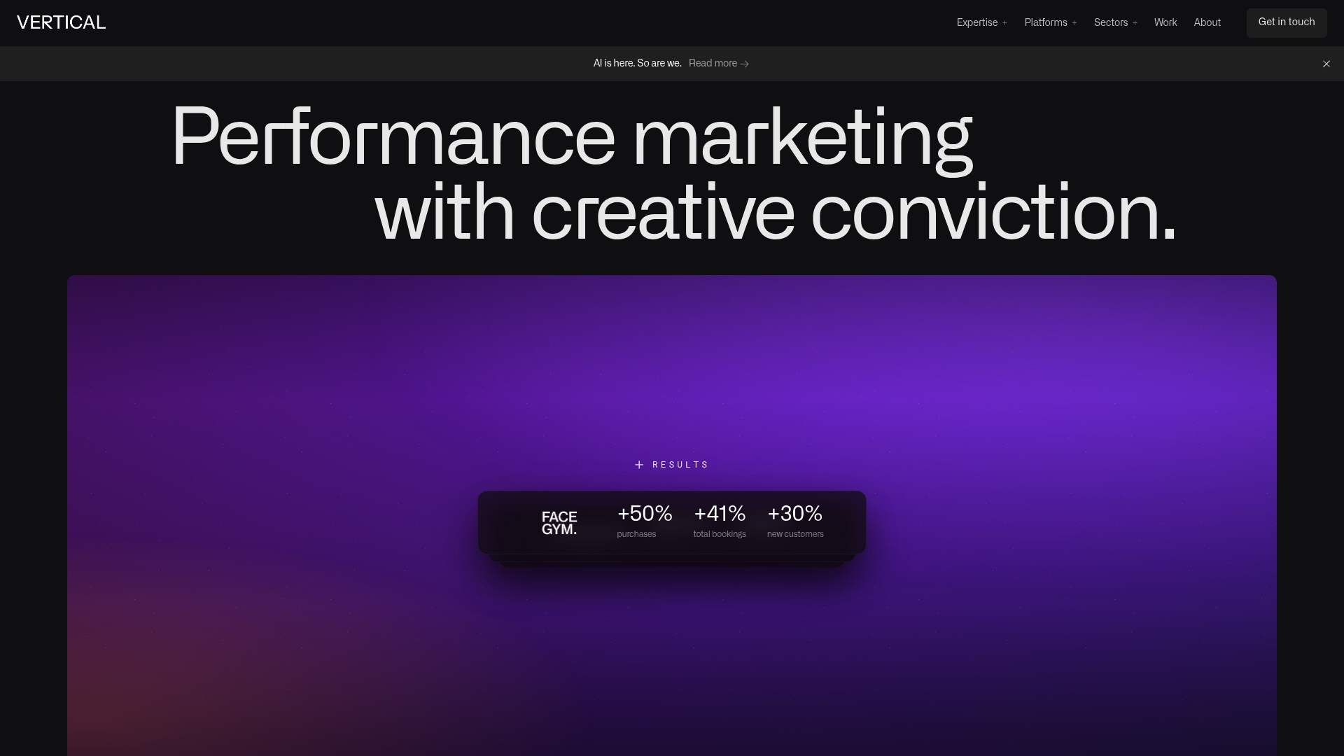
Clarity on a pricing page rarely comes from guesswork. It comes from structured copy, a tested layout, and a team that treats the page as a growth lever rather than a static document. Vertical’s blend of creative design, conversion-focused web development, and performance marketing experience, demonstrated in results like FACEGYM’s lift in purchases and bookings, gives teams a direct path from audit to working experiment.
- An audit of your current pricing page against the fundamentals covered here.
- A prioritized roadmap of the highest-impact tests for your traffic and buyer mix.
- Execution support for design, copy, and the analytics setup needed to read results.
Visit Vertical’s services page to start a conversation about your pricing page roadmap.
FAQ
What are the 5 C’s of pricing?
The 5 C’s commonly cited in pricing strategy are cost, customers, competition, channels, and context, used together to set a price that reflects both business economics and market position. Definitions vary slightly by source, so treat this as a general framework rather than a fixed formula.
What is pricing optimization?
Pricing optimization is the ongoing process of testing and refining price points, plan structure, and presentation to improve both conversion and revenue per customer. It combines pricing strategy with page design, messaging, and structured experimentation rather than a one-time price decision.
What are the 7 pricing strategies?
Commonly referenced pricing strategies include cost-plus pricing, competitive pricing, value-based pricing, penetration pricing, skimming, bundle pricing, and freemium pricing. Which strategy fits best depends on the market, the product’s cost structure, and how buyers typically compare alternatives.
What is the best design for a pricing page?
The most effective pricing pages limit buyers to a few tiers, use a good-better-best layout, and visually highlight one recommended plan. Design-first best practices also point to tooltips and accordions for feature detail, since they keep the page scannable without hiding the comparison a buyer actually needs.
How often should a pricing page be tested or updated?
Most teams benefit from a continuous but prioritized testing cadence rather than sporadic redesigns, running one or two focused experiments at a time and letting each reach significance before moving on. A full structural rebuild is usually only necessary when tier overlap, outdated positioning, or new product lines make the existing page genuinely confusing.
Sources
- State of business buying 2026 — Forrester blog
- Software pricing transparency — G2 Learning
- Pricing page best practices | Figma resource library
- How to design pricing tables that convert better — Telerik blog
Recommended

Other posts
































































Stay ahead with better decisions.
Get business insights today.
