One Hour Audit: 7 Conversion Centered Design Rules for UK Teams

Conversion centered design (CCD) is a landing page discipline built on seven proven principles: encapsulation, contrast, directional cues, white space, urgency and scarcity, try-before-you-buy, and social proof. The first move is always the same. Pick one conversion goal, then rewrite your headline so it matches exactly what the visitor just clicked or searched for. Everything below explains why that works and how to apply it.
TL;DR:
- Focusing on message match between ads and the landing page headline significantly boosts conversion, with misaligned copy causing visitor doubt.
- Keeping the primary CTA visible above the fold on both mobile and desktop reduces bounce rates and guides quick engagement.
- Limiting form fields to three or fewer or splitting longer forms into multiple steps greatly improves completion rates.
- Proper placement of trust signals, such as testimonials near the CTA and specific review counts, enhances credibility and reduces hesitation.
- Ensuring fast load speeds and mobile-friendly layouts is critical, as slow or poorly optimized pages cause visitor abandonment before they see the CTA.
Table of Contents
- What Is Conversion Centered Design and Why Do the 7 Principles Matter?
- How Do You Build a Hero Section That Actually Converts?
- What Makes a CTA and Form Actually Convert?
- How Do You Guide a Visitor’s Eye to the CTA?
- Where Should Trust Signals and Social Proof Actually Go?
- Why Do Speed and Mobile Layout Move Conversion Rates?
- How Should You Turn Design Decisions Into Tests?
- What Does a One-Page Conversion Audit Look Like?
- How Vertical Applies Conversion Centered Design in Practice
- Three Trade-Offs We’ve Tested Between Design Instinct and Data
- Get a Conversion Audit Built on These Principles
- Sources
What Is Conversion Centered Design and Why Do the 7 Principles Matter?
CCD isn’t a decoration exercise. Every color, headline, and button placement should be treated as accountable content, something you can measure against a business outcome, not something you chose because it looked good in a mood board. That distinction shapes how Shopify frames the discipline: the biggest misconception marketers carry into a redesign is that CCD is a visual style. It’s closer to a set of behavioral rules, first codified by Unbounce’s guide to the seven principles, that structure a page around a single decision you want a visitor to make.
Here’s how each principle plays out on a real page.
- Encapsulation. Contain the call to action and its supporting proof inside a visually bounded area, a card, a shaded panel, a border, so the eye reads it as one decision unit instead of scattered content.
- Contrast. Your CTA button should be the loudest element on the page. If your brand palette is navy and gray, the button is not navy or gray. Orange, yellow, or a bright accent that appears nowhere else works because the eye is drawn to what’s different, not what’s pretty.
- Directional cues. Arrows, lines, and even the gaze direction of a person in a photo should point toward the CTA. A hero image of someone looking off to the left pulls attention left, away from a right-aligned button. Fix the image or flip the layout.
- White space. Empty space isn’t wasted space. It’s what makes the CTA look important. Cramming testimonials, badges, and secondary links around your button dilutes its visual weight.
- Urgency and scarcity. A countdown timer or “only 4 left” note works best placed directly beside the CTA, not buried in a banner at the top of the page where it loses its connection to the action.
- Try-before-you-buy. Free trials, sample content, or an interactive demo lower the psychological cost of clicking. Even a 30-second product video near the CTA does this job on pages that don’t offer a literal trial.
- Social proof. A specific testimonial, review count, or client logo placed within the same visual frame as the CTA reduces hesitation right when the visitor is deciding.
VWO’s research on design principles that increase conversions backs the same conclusion from a different angle: containment, contrast, and trust cues don’t work in isolation. They compound. A high-contrast button with no social proof nearby underperforms the same button sitting next to a review count. Treat the seven principles as a system, not a menu you pick two items from.
How Do You Build a Hero Section That Actually Converts?
The top of your page decides whether a visitor stays or bounces, and most heroes fail for one avoidable reason: they don’t match what the visitor was promised before they arrived.
- Match your headline to the traffic source. If the ad said “50% off your first order,” the headline on the landing page needs to say the same thing in the same words. Any gap between ad copy and headline copy creates a half second of doubt, and that doubt costs clicks. This is often the single highest-leverage fix on a page, ahead of any visual change, according to FoundryCRO’s landing page benchmarks.
- Put the CTA where a thumb can reach it without scrolling. On mobile, that means above the fold and sized generously, not a slim text link squeezed into a corner. On desktop, the button should be visible within the first screen a visitor sees, full stop.
- Stack one piece of trust proof into the hero itself. A single testimonial line, a client logo, or a specific number (“Trusted by 2,400 UK retailers”) does more work in the hero than three vague trust badges further down the page.
- Hold your attention ratio at 1:1. That means one campaign, one goal, one CTA. If your hero links to your homepage, your pricing page, and a newsletter signup, you’ve built three exits instead of one entrance. Cut every link that isn’t the conversion goal.
Getting the hero right often means rethinking layout choices you inherited from a template. Our landing page design guide walks through how visual hierarchy and message clarity interact once you get past the fold, which is where a lot of these hero decisions either pay off or quietly fall apart.
What Makes a CTA and Form Actually Convert?
Buttons and forms are where most of the friction lives, and most of it is self-inflicted. A CTA that says “Submit” tells the visitor nothing about what they get. A CTA that says “Get My Free Audit” tells them exactly what happens next.
- Write CTA copy around the benefit received, not the action taken: “Start Saving Today” beats “Click Here,” and “Get My Quote” beats “Submit Form.”
- Keep contrast and size consistent with the hero rule: the button should be the visually loudest element on every page section it appears in, repeated for scroll depth but never competing with a second call to action.
- Cut form fields to the minimum the next step actually requires. Every field beyond name, email, and one qualifying question adds measurable drop off, and FoundryCRO’s data points to form length as one of the highest-impact levers on the whole page.
- For anything beyond four or five fields, switch to a multi-step form. Splitting a long form into two or three short screens increases completion because each step feels smaller than the whole.
- Use autofill-friendly field names and microcopy that answers objections inline, a line like “We never share your email” next to the submit button does real work.
Pro Tip: Test your form’s field count before you test anything else on the page. A five-field form and a three-field form asking for the same information can produce wildly different completion rates, and that gap usually dwarfs any button color change you’re tempted to run instead.
Voice-of-customer research should drive this copy, not internal guesswork about what sounds persuasive. Our conversion copywriting piece covers how to validate CTA language against real user data before you commit a whole campaign to it.
How Do You Guide a Visitor’s Eye to the CTA?
Visual hierarchy isn’t abstract design theory. It’s a set of concrete choices that either point a visitor’s eye toward your button or scatter it across the page.
Lines, arrows, and gaze direction all function as directional cues. A photo of a person looking toward your CTA does measurably more work than the same photo with the subject facing away or straight at the camera. Diagonal lines in a background graphic, a progress bar, even the angle of a product shot, all of these can be aimed like a signpost if you’re deliberate about layout.
Typographic scale and color build the hierarchy underneath those cues. Your headline should be the largest text on the page, your subheadline smaller, and your body copy smaller still, with only one accent color reserved for the CTA. When three different elements compete for “brightest color on the page,” none of them wins.
Imagery choice matters more than most teams budget for. A product shot that shows the benefit in use, someone actually wearing the item, using the tool, or enjoying the result, outperforms a plain studio shot every time, because it does double duty: it illustrates value and it can be composed to lead the eye toward the CTA.
White space is the quiet enforcer of all of this. VWO’s guidance on design principles treats space around a CTA as functionally identical to a spotlight: the emptier the area immediately surrounding your button, the more visual weight that button carries. Resist the urge to fill every gap with a badge, an icon, or another line of copy.

Where Should Trust Signals and Social Proof Actually Go?
Not all trust signals do the same job, and stacking them randomly down a page wastes most of their power.
- Logo bars work best just below the hero, where they establish credibility fast for a visitor who doesn’t yet know your brand.
- Testimonials carry more weight closer to the CTA, right where hesitation peaks, because a specific quote answers the objection a visitor is silently having at that exact moment.
- Review counts function well as a persistent header or footer element, a constant low-level signal rather than a one-time proof point.
Specificity is what separates a persuasive trust signal from a decorative one. “Trusted by thousands” reads as filler. “Chosen by 1,247 marketing teams across the UK” reads as fact, and odd, precise numbers tend to read as more credible than round ones because they sound measured rather than invented.
Restraint matters just as much as placement. Limit trust badges and seals to one or two above the fold. A wall of five certification icons and three payment logos crammed into the hero doesn’t build trust, it builds visual noise that competes with your CTA for attention. Skypher’s guide to trust page best practices makes the same point about testimonial and review widget placement: fewer, better-placed signals consistently outperform a cluttered trust wall.
Why Do Speed and Mobile Layout Move Conversion Rates?
Most landing page audits find the biggest conversion leak isn’t a copy problem or a color problem. It’s a loading-speed problem, and it happens before the visitor ever sees your carefully designed CTA.
Three performance benchmarks matter most. Largest Contentful Paint (LCP) should land under 2.5 seconds, Interaction to Next Paint (INP) under 200 milliseconds, and Cumulative Layout Shift (CLS) under 0.1. LanderLab’s best-practices guide treats these three targets as the backbone of any serious page build, ahead of visual polish, because a page that loads slowly never gets the chance to show off its design at all.
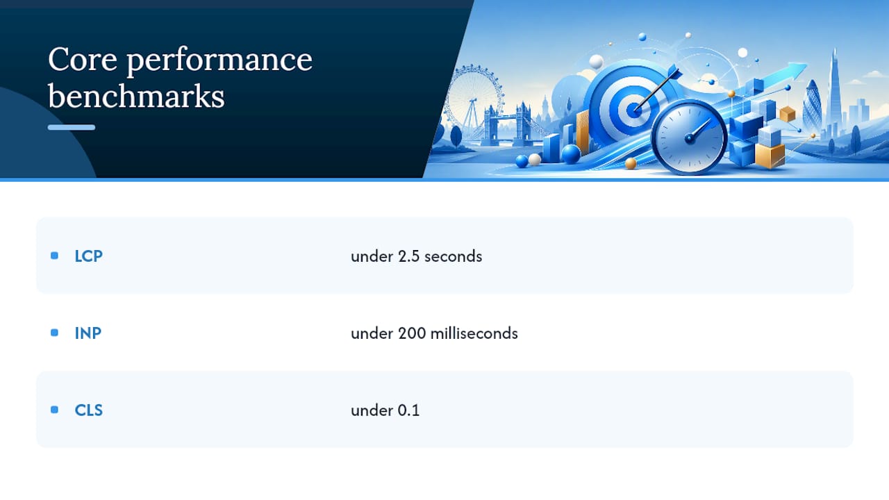
By the numbers: a visitor who experiences layout shift while a page loads, buttons jumping, images popping in late, is measurably more likely to abandon before your CTA even finishes rendering, which is exactly what CLS is designed to catch.
Mobile-first design has to start with the thumb, not the eye. Your CTA needs to sit in the thumb zone, the lower two thirds of the screen where a hand naturally rests, with a tap target no smaller than roughly 44 by 44 pixels. Mobile copy should run shorter than desktop copy across the board, not because mobile readers care less, but because scanning speed on a small screen rewards brevity over elaboration.
Fixing speed issues usually means auditing image weight, third-party scripts, and hosting before touching a single design element. Our site speed fix plan breaks down the technical order of operations for getting a slow page under those three benchmarks without a full rebuild.
How Should You Turn Design Decisions Into Tests?
Design instinct gets you a reasonable first draft. It never gets you a proven page. That gap only closes with structured testing, and the discipline starts with writing a real hypothesis instead of a hunch.
- Write the hypothesis in a fixed format. A workable template, drawn from how agencies actually run this: “When we change element] for traffic from [segment], we expect [metric] to move by [amount] because [reason].” That structure, outlined in [GoGoChimp’s build-order guidance, forces you to name the mechanism before you launch the test, which makes the result interpretable either way.
- Prioritize what you test. Headline and message match go first, since they tend to produce the largest lifts. Form length and offer framing come next. Button color and micro-visual tweaks go last, because they usually move the needle the least, a pattern Centercode’s guidance on hypothesis-driven decisions treats as a near-universal finding across teams that test rigorously.
- Set your sample size and stop rule before launch. Decide how many conversions or how many days constitute a valid read, and commit to it in writing. Checking results daily and stopping the moment a variant looks ahead is the single fastest way to declare a false winner.
- Change one variable per test. Running a new headline and a new CTA color in the same test tells you a page won, not why it won, and you’ll have no idea which change to keep on the next redesign.
A structured testing framework turns every redesign into evidence instead of opinion. Our creative testing framework lays out a version of this cadence you can run inside a single sprint.
What Does a One-Page Conversion Audit Look Like?
A usable audit fits on one page and takes under an hour to run against a live URL. Structure the page itself around seven functional blocks, each with one job:
-
Hero: message match plus a visible CTA, no exceptions.
-
Problem or benefit statement: names the visitor’s situation in their own language.
-
Proof block: one specific testimonial or client result.
-
Feature or offer detail: three benefits, not features, stated as outcomes.
-
Objection handling: answers the one or two doubts most visitors have.
-
Secondary proof: logo bar or review count for reinforcement.
-
Final CTA: repeats the same single goal, same copy, same visual weight as the hero button.
That build order mirrors the sequence GoGoChimp’s agency guidance recommends for teams that want repeatable results rather than one-off wins, and it lines up with the seven-section blueprint FoundryCRO used for the same reason.
| Audit item | Pass condition |
|---|---|
| Headline | Matches the ad, email, or search query word for word |
| CTA visibility | Visible with zero scrolling on mobile and desktop |
| Trust proof | At least one specific testimonial or number above the fold |
| Form length | Three fields or fewer, or split into multi-step |
| Speed | LCP under 2.5 seconds, CLS under 0.1 |
| Test plan | A written hypothesis exists before the next change ships |
A short copy template speeds up the rebuild: headline states the outcome in six words or fewer, three bullets state benefits as results, and the CTA button repeats the single action in three words or fewer. Keep every element traceable back to the one goal you picked at the start.
How Vertical Applies Conversion Centered Design in Practice
Vertical Brands builds landing pages and campaigns around the same seven principles covered above, treating every visual decision as something to measure, not something to admire. That approach runs across strategy, design, and performance marketing under one team, so message match between an ad and its landing page isn’t a handoff between two vendors, it’s one continuous decision.
- A client saw a significant increase in purchases and bookings after this kind of integrated work replaced a fragmented, multi-vendor setup.
- Another client benefited from the same strategy-to-execution model, producing measurable outcomes rather than a redesign for its own sake.
- The consistent thread across both: one conversion goal per page, message match enforced from ad to landing page, and every design change tied to a test rather than a preference.
Editorial perspective throughout this article is attributed to Alex, drawing on.
Three Trade-Offs We’ve Tested Between Design Instinct and Data
Short pages don’t always beat long ones, and the conventional wisdom that “shorter always converts better” oversimplifies a real trade-off. A single, high-intent product with a clear price wins with a short page: one hero, one proof block, one CTA. A complex or expensive offer, the kind that needs education before a decision, often converts better with a longer page that builds the case section by section. The mistake isn’t picking the wrong length. It’s picking a length without testing whether your specific offer needs more convincing or less.
Choice reduction gets preached as gospel, and mostly it should be. Fewer options usually beats more. But cutting every alternative isn’t always the right call, sometimes a visitor genuinely needs to see two tiers to trust that the one you’re pushing is priced fairly. The rule that actually holds up: remove choices that don’t change the decision, keep the ones that build confidence in it.
Brand polish and a clear conversion path get treated as opposites more often than they should be. A page can look distinctly on brand and still follow every rule of contrast, encapsulation, and directional flow. The failure mode isn’t choosing beauty over function. It’s letting brand guidelines override contrast rules on the one element, the CTA, where contrast matters most. Protect that one exception, and polish and conversion stop competing.
— Alex
Get a Conversion Audit Built on These Principles
Most agencies hand you a redesign and a design system. Vertical Brands hands you a page built to one goal, tested from the first draft, with strategy, design, and performance media working from the same brief instead of three separate ones. That’s the practical difference: no handoff gap between the team that writes your ad and the team that builds the page it lands on, which is usually where message match quietly breaks down.
If your current page is guessing instead of testing, a conversion audit is the fastest way to find out where. We’ll walk through your hero, your CTA and form setup, your trust placement, and your page speed against the benchmarks covered above, then hand you a prioritized list of what to fix first. Get in touch with Vertical Brands to start the audit and see where your page is losing visitors before they ever reach your CTA.
Sources
The seven principles covered throughout this piece trace back to Unbounce’s original CCD framework, still the clearest single reference for the encapsulation, contrast, and social proof rules. For the page-build sequence and benchmark data behind the hero and form sections, FoundryCRO’s landing page guide and LanderLab’s best-practices breakdown both go deeper into performance targets and structural ordering. VWO’s design principles guide is worth reading for the behavioral reasoning behind contrast and hierarchy, and Shopify’s take on the CCD misconception is the sharpest short read on why aesthetics alone never carries a page.
- The 7 Principles of Conversion-Centered Design — Unbounce
- Design principles to increase conversions — VWO
- Landing page best practices — LanderLab
- Conversion-centered design — Shopify blog
Recommended

Other posts































































Stay ahead with better decisions.
Get business insights today.
