What Makes a Product Page Convert in 2026

A high-converting product page is decision-first, scannable, trustworthy, and fast. It tells a shopper exactly what they’re buying, what it costs, and why they should trust you, all before they scroll. Baymard Institute’s benchmark has audited hundreds of ecommerce product pages against strict usability criteria, and relatively few clear that bar. Most fail on structure, not creativity.
Run this audit on your own PDP right now:
- Is the hero image loaded and sharp within a second or two?
- Is the price visible without scrolling?
- Is the “add to cart” button impossible to miss?
- Can shoppers pick a size or color without opening a dropdown?
- Does a trust signal (reviews, returns, secure checkout) appear near the buy box?
We built this checklist by combining Nielsen Norman Group’s decision-first framework with the practical audit work we do at Vertical Brands for ecommerce clients. If your page fails two or more of these checks, the rest of this guide tells you exactly what to fix first.
Key Takeaways
A high-converting product page puts identity and purchase action first, backs every claim with visible trust signals, and loads fast enough that none of that work goes to waste.
| Point | Details |
|---|---|
| Lead with the buy box | Show title, price, rating, and CTA above the fold before anything else. |
| Use scale shots | Add a size-reference photo to reduce the fit uncertainty that drives returns. |
| Keep copy scannable | Open with a benefit sentence, then 4 to 6 bullets; save deep specs for accordions. |
| Protect Core Web Vitals | Optimize images and defer noncritical scripts so LCP and CLS don’t cost you the sale. |
| Vertical Brands as proof | Vertical’s FACEGYM rebuild paired clearer buy-box hierarchy and CTA contrast with real measurement, driving a significant rise in purchases. |
Table of Contents
- Essential Elements Every Product Page Needs
- What Should Appear Above the Fold?
- How Many Product Images Should a Page Show?
- Writing Product Copy That Actually Gets Read
- Building Trust Without Slowing Down the Checkout Decision
- Choosing Sizes and Variants Without Losing the Sale
- How Should Reviews and Q&A Be Organized?
- Why Mobile Speed Determines Whether Shoppers Stay
- What SEO Basics Does a Product Page Need?
- Which Metrics Actually Prove a Product Page Works?
- Reusable Templates for Your Next PDP Build
- Proof From the Field: The FACEGYM Rebuild
- What This Guide Gets Right That Most Advice Doesn’t
- Turn This Playbook Into a Rebuilt Product Page
- Sources
Essential Elements Every Product Page Needs
Every effective product layout rests on a handful of non-negotiable parts. Skip one, and you create friction at the exact moment a shopper is deciding whether to buy.
- Title and identity — Match your on-page H1 to the product name shoppers searched for. Don’t get clever with naming here.
- Price — Show it in full, near the top, with no math required to find the real cost.
- Primary CTA — One dominant “add to cart” button, visually louder than every other element on the page.
- Variant selectors — Color, size, and material choices need to be visible, not buried in a menu.
- Specs and dimensions — Shoppers comparing products want facts, not adjectives.
- Hero image and gallery — The first photo shoppers see does more selling than any paragraph of copy.
Shopify’s own guidance on ecommerce fundamentals backs this list almost exactly: high-quality images, concise descriptions, price, availability, and a clear CTA show up again and again in pages that convert well.
Before you launch or relaunch a PDP, run through this technical checklist with your content and dev teams:
- Confirm the H1 matches the product title used in navigation and search
- Verify price displays without requiring a click or hover
- Test that variant selection updates the image and price instantly
- Check that specs render in a scannable format, not a wall of text
- Confirm the CTA button color passes contrast checks against the background
Cartylabs’ audit of high-converting Shopify stores found 17 recurring elements across pages that perform well, and nearly all of them trace back to this core list. Get these right before you touch anything else.
What Should Appear Above the Fold?
The buy box is the single most important few inches of real estate on your page. NN/g’s research is blunt about this: shoppers want product identity and the purchase action first, with benefits, social proof, and objection handling coming after, not before.
On desktop, that means a two-column layout. The buy box sits on the right: title, star rating, price, variant selectors, CTA, and a one-line shipping note, stacked in that exact order. Nothing else competes for attention in that column.
On mobile, that layout collapses into a single stacked flow, but the priority order stays identical. Title first, then rating, then price, then the variant picker, then the CTA. Anything below that, like long-form description or specs, waits until the shopper has scrolled.
The above-the-fold checklist:
- Product title and one-line value statement
- Star rating with clickable review count
- Full price, including any discount framing
- Variant selectors (visible, not hidden)
- Primary CTA button
- One-line shipping or delivery estimate
Pro Tip: Add a sticky mobile buy bar that pins the price and CTA to the bottom of the screen once the shopper scrolls past the hero image. Keep the touch target at least 44 by 44 pixels so thumbs can hit it reliably on a phone held one-handed.
How Many Product Images Should a Page Show?
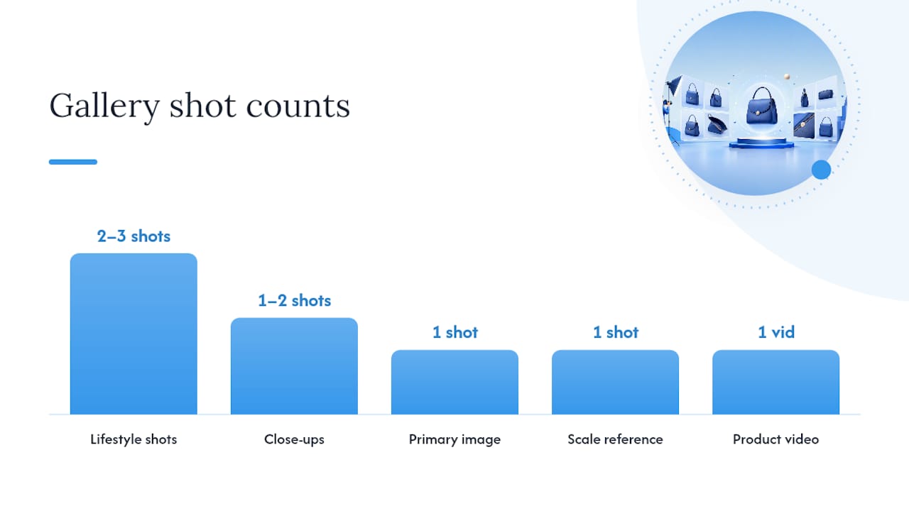
Media does more selling than copy ever will, but only when it’s built with intention. A strong gallery mixes five distinct shot types: a clean white-background primary image, two or three lifestyle shots showing the product in use, one or two close-ups on texture or detail, a scale reference shot, and a short product video running 15 to 30 seconds.
That scale shot matters more than most teams assume. Baymard’s research on product page usability found that shoppers frequently can’t judge size from photos alone, and that ambiguity is a quiet driver of returns. A photo showing the product next to a hand, a coin, or a common household object solves this instantly, and it costs almost nothing to produce.
Delivery matters as much as content. Follow this checklist to protect page speed while still showing rich media:
- Serve images in WebP or AVIF format, not legacy JPEG, wherever browser support allows
- Lazy-load every image below the fold, but never lazy-load the hero shot
- Reserve an aspect-ratio box for each image so nothing shifts as assets load
- Compress video thumbnails aggressively; autoplay only on mute with a visible unmute control
Shopify’s product page research points to the same conclusion from a different angle: pages with thin media and slow load times consistently show higher abandonment. Treat your media stack as a performance decision, not just a creative one.
Writing Product Copy That Actually Gets Read
Nobody reads a product page top to bottom. They scan for the one or two facts that answer their specific question, then move to the CTA. Your copy structure needs to respect that.
Open with one or two sentences that lead with the benefit, not the feature. “Keeps your feet dry through a 10-mile trail run” beats “Made with waterproof membrane technology” every time, because it answers the shopper’s actual question: what does this do for me? Follow that opening with four to six scannable bullets covering the details a benefit-first sentence can’t carry: materials, dimensions, care instructions, what’s included in the box.
Keep the main description body between 100 and 200 words. Anything longer belongs in an accordion, not the main flow. Save deep technical specs, sizing charts, and warranty language for expandable sections below the fold, where interested shoppers can dig in without forcing everyone else to scroll past it.
A few microcopy examples worth stealing:
- CTA button: “Add to Cart” beats generic labels like “Buy” or “Submit” for clarity
- Low stock: “Only 4 left in your size” creates honest urgency without gimmicks
- Variant label: “Color: Slate Blue” reads cleaner than a swatch with no text label
Shopify’s own PDP guidance backs the bullet-plus-benefit structure directly, listing concise descriptions alongside price and imagery as one of the handful of features that separates pages that convert from pages that don’t.
Building Trust Without Slowing Down the Checkout Decision
Shoppers abandon PDPs at the last second for reasons that have nothing to do with the product itself. Hidden shipping costs, vague return policies, and unfamiliar checkout badges are some of the most common last-minute deal breakers.
Show the final price and a realistic shipping estimate right next to the CTA, not three clicks later at checkout. If you offer buy-now-pay-later options like Klarna or Afterpay, display the per-installment price directly under the full price. That single line often does more to move hesitant buyers than any discount banner.
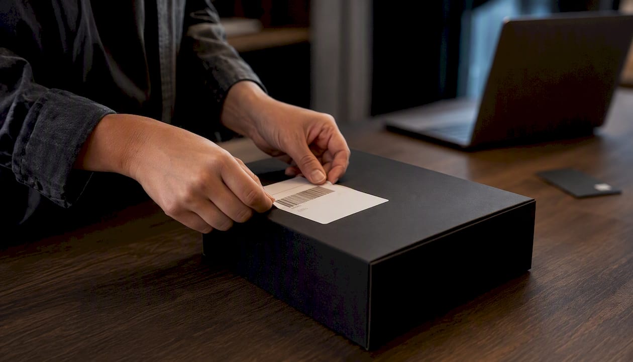
Summarize your return policy in one sentence directly on the PDP, something like “Free returns within 30 days,” with a link to the full policy for anyone who wants the fine print. Burying this in a footer link costs you buyers who won’t dig for it.
Trust signals worth including near the buy box:
- Secure checkout badge (SSL lock icon or payment processor logo)
- Recognizable payment icons: Visa, Mastercard, PayPal, Apple Pay
- Honest urgency only, like real stock counts, never fabricated countdown timers
- A one-line return policy summary linked to the full page
Pro Tip: Test your BNPL messaging placement specifically. Moving the per-installment price from below the fold to directly under the main price is one of the cheapest layout changes you can make, and it consistently shows up as a meaningful lever in conversion audits.
Choosing Sizes and Variants Without Losing the Sale
Fit uncertainty kills more sales than price does in apparel, footwear, and anything sold in multiple dimensions. The fix starts with how you present the choice itself.
Use visible buttons or color swatches for primary variants. Hidden dropdown menus add a click and hide information a shopper needs to compare options quickly. If a color or size is out of stock, show it grayed out rather than removing it entirely, so shoppers understand what exists even if they can’t buy it today.
Pair every apparel or footwear listing with a clearly labeled size chart, and include fit notes wherever possible: “Runs small, order one size up” carries more weight coming from real buyers than from brand copy. Surfacing reviewer-reported sizing, even something as simple as “shown here in a size 8, true to size,” reduces the guesswork that drives returns.
- Use buttons or swatches, not dropdowns, for color and size selection
- Show out-of-stock variants as grayed out instead of hiding them
- Include a labeled size chart with measurements in inches and centimeters
- Surface reviewer fit context directly in the size guide or nearby
For categories where sizing is genuinely hard to standardize, like footwear across different brands, a fit-finder quiz or a generous return window does more to unblock a purchase decision than any amount of extra copy.
How Should Reviews and Q&A Be Organized?
Social proof works best when it answers a specific question, not when it’s just a number sitting in a corner. Place your star rating directly next to the product title, and make the review count clickable so it jumps straight to the review section. That single interaction lets curious shoppers self-serve the exact detail they’re looking for.
Photo and video reviews carry more weight than text alone, because they show the product in real conditions instead of a studio. Encourage them actively, through post-purchase email prompts or small incentives, and once you have a meaningful volume, add filters so shoppers can sort by “Most Recent,” “With Photos,” or by size and variant purchased.
A customer Q&A section, or a short FAQ authored directly on the PDP, catches the objections that repeat across every product in a category: “Does this run true to size?” “Is this machine washable?” Answering those once, visibly, saves your support team from answering them a hundred times over email.
- Place the star rating and clickable review count near the title
- Prioritize surfacing photo and video reviews over text-only entries
- Add sort and filter options once review volume supports it
- Add a short Q&A or FAQ block addressing the most repeated objections
Pro Tip: Pull your three most common support tickets for a given product and turn them into Q&A entries directly on the PDP. It’s the fastest way to find content gaps you didn’t know existed.
Why Mobile Speed Determines Whether Shoppers Stay
Most ecommerce traffic now arrives on a phone, which means your mobile layout isn’t a secondary version of the desktop page. It’s the primary experience most shoppers will ever see.
Stack elements in strict priority order: hero image, title, rating, price, variant selector, CTA. Pin a sticky add-to-cart bar to the bottom of the screen once the shopper scrolls past the initial hero, and keep it visible through the entire scroll, including the review section.

Performance has to back up that layout. Compress and serve responsive images with a proper srcset, inline critical CSS so the buy box renders instantly, and defer any JavaScript that isn’t required for the first paint, things like chat widgets or personalization scripts. Cartylabs’ audit of high-performing Shopify stores treats mobile optimization and a sticky CTA as non-negotiable, not optional polish.
Core Web Vitals aren’t just a technical vanity metric here. Largest Contentful Paint, Cumulative Layout Shift, and Interaction to Next Paint all feed directly into both Google’s ranking signals and how fast a shopper can act on the page. A page that shifts layout while loading, pushing the CTA down half a second after the shopper reaches for it, loses taps it never gets back.
- Stack mobile content in strict priority order, hero to CTA
- Pin a sticky add-to-cart bar through the full scroll experience
- Inline critical CSS and defer noncritical scripts
- Treat LCP, CLS, and INP as design acceptance criteria, not afterthoughts
What SEO Basics Does a Product Page Need?
Search visibility for a PDP comes down to a short list of fundamentals, and most teams either skip them or overcomplicate them. Neither serves the page.
Write a title tag that includes the product name and one distinguishing detail, like a key material or size range, and keep your meta description under 160 characters with a clear reason to click. Your H1 should match the product title exactly, no keyword stuffing required.
Every product image needs descriptive alt text that names the product and, where relevant, the variant shown, both for accessibility and for image search visibility. If you sell the same product across multiple color or size URLs, set canonical tags pointing to a single authoritative version so search engines don’t split ranking signals across duplicates.
- Write a title tag with the product name and one distinguishing detail
- Add descriptive, variant-specific alt text to every product image
- Set canonical tags across duplicate variant URLs
- Implement Product schema markup and validate it with Google’s Rich Results Test
Structured data closes the loop. Product schema with price, availability, and aggregate rating fields makes your listing eligible for rich results in search, showing stars and pricing directly in the SERP. A growing body of guidance on AI and structured product content points to the same conclusion: clean, well-marked product data is becoming more important, not less, as AI search tools parse ecommerce pages directly.
Which Metrics Actually Prove a Product Page Works?
Track four numbers on every PDP: conversion rate, add-to-cart rate, bounce rate, and the rate at which add-to-cart sessions actually reach checkout. Each one isolates a different point of friction.
- Define the hypothesis first. State what you’re changing and why you expect it to move a specific metric, not just “test the button color.”
- Pick one metric per test. A CTA color test should be judged on click-through to cart, not on revenue three steps downstream.
- Run for a full business cycle. Give tests at least one to two weeks, covering weekday and weekend behavior, before reading results.
- Diagnose before you test. Use session replay tools and heatmaps to find where shoppers hesitate before you guess at a fix.
Practical CRO guidance on structuring these experiments echoes this exact sequence: diagnose with qualitative tools, form one testable hypothesis, then run a single-variable test long enough to trust the result.
Reusable Templates for Your Next PDP Build
Steal these directly.
Three microcopy snippets worth reusing:
- CTA: “Add to Cart” over generic alternatives
- Stock note: “Only 3 left in Medium” instead of a vague “Limited stock”
- Shipping shorthand: “Free shipping, arrives in 3 to 5 days”
For a mini-example layout, picture a hiking boot PDP: hero gallery on the left including one scale shot next to a size 10 boot, buy box on the right with the size chart link sitting directly under the variant selector, and the review summary positioned immediately below the CTA rather than buried at the page’s bottom. That placement order isn’t arbitrary. It mirrors exactly how NN/g’s research says shoppers actually move through a decision.
Proof From the Field: The FACEGYM Rebuild
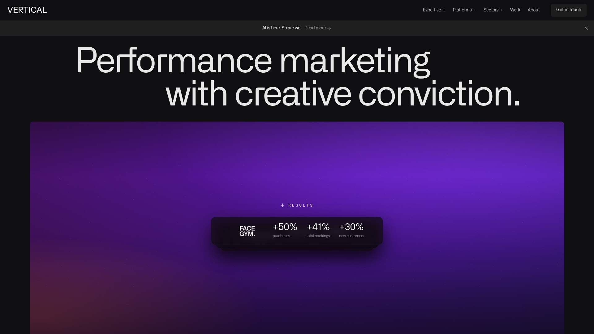
Theory only goes so far. When Vertical Brands rebuilt product and booking pages for FACEGYM, the changes tracked closely with the priorities in this guide: clearer buy-box hierarchy, sharper CTA contrast, and tighter measurement of what shoppers actually did on the page.
The changes that tend to move numbers most consistently across projects like this are media quality, CTA clarity, and having real measurement in place before you start guessing at fixes.
Run this 30-minute audit on your own page:
- Time how long it takes your hero image to load on a throttled connection
- Check if your CTA is the visually loudest element above the fold
- Confirm your review count is clickable and your rating is visible near the title
What This Guide Gets Right That Most Advice Doesn’t
Most product page advice treats every element as equally important, which is exactly backward. The research is clear that decision-first hierarchy, the buy box, the price, the CTA, beats almost every other factor combined. Get that wrong and no amount of polished copy or clever upsell logic saves the page.
The conventional wisdom oversells novelty. Augmented reality try-on, elaborate configurators, and animated hero sections all sound compelling in a pitch meeting, but NN/g’s own guidance is direct about this: those features only help when they’re executed flawlessly, and most teams don’t have the budget or the discipline to pull that off. A plain, fast, well-structured page beats a half-built fancy one every time.
If you take one thing from this guide, prioritize the buy box and page speed before you touch anything creative. Media and copy matter enormously, but they only convert on a foundation that already loads fast and makes the purchase decision obvious.
— Alex
Turn This Playbook Into a Rebuilt Product Page
Reading a checklist and executing it under a deadline are two different problems. Vertical Brands is the team ecommerce brands call when they need this playbook implemented properly, not just understood: strategy, creative, and web development working from one roof instead of three disconnected vendors passing the project back and forth.
If your product pages are underperforming and you’d rather not run this audit alone, talk to Vertical Brands about a PDP rebuild scoped to your store and your numbers.
Sources
- Baymard Institute — Product page examples / benchmark
- Nielsen Norman Group — Ecommerce product pages
- Cartylabs — Shopify product page best practices
Recommended

Other posts



























































Stay ahead with better decisions.
Get business insights today.
