Marketing Dashboard KPIs: A 2026 Guide for Analysts

If you’re building a marketing dashboard from scratch, put these metrics on it: revenue (your North Star), CAC, CLTV, ROAS, conversion rate, website traffic by channel, click-through rate, average order value, retention rate, and marketing-sourced pipeline. That range is a recommended count for executive dashboards. BigCommerce and Sona both point to 8 to 12 as the sweet spot for executive dashboards. Fewer and you’re missing funnel context; more and nobody reads past the first row.
Here’s why each category earns its slot:
- Revenue metrics (revenue, CAC, CLTV, ROAS) tell you whether spend is working.
- Funnel signals (conversion rate, website traffic, CTR) tell you where things break.
- Retention numbers (repeat purchase rate, churn) tell you if you’re keeping what you paid to acquire.
Your first move isn’t picking a tool. It’s naming your North Star metric, tying it to revenue, and connecting your CRM and ad platforms as data sources before you open a single dashboard builder. Then schedule a recurring review, weekly at minimum, so the numbers actually change decisions instead of collecting dust in a tab nobody opens.
Key Takeaways
A marketing dashboard works when it centers on one revenue-tied North Star metric supported by 8 to 12 KPIs with clear owners and a defined review cadence.
| Point | Details |
|---|---|
| Cap your KPI count | Limit dashboards to 8 to 12 metrics across acquisition, engagement, and revenue to avoid decision fatigue. |
| Start with the North Star | Pick one revenue-tied metric first, then build supporting KPIs around it by funnel stage. |
| Match tool to team size | Use Looker Studio or HubSpot for fast, marketer-first builds; Power BI or Tableau for complex enterprise modeling. |
| Assign ownership and cadence | Every KPI needs a named owner, a documented formula, and a set review frequency to stay trustworthy. |
| Get expert help building it | Vertical Brands offers KPI audits and dashboard builds that pair strategy with tracking and attribution fixes. |
Table of Contents
- Which Marketing KPIs Actually Belong on Your Dashboard?
- Which KPIs Should You Track for Each Marketing Goal?
- How Do You Build a Marketing KPI Dashboard Step by Step?
- What Are the Formulas Behind Each Core Marketing KPI?
- Which Dashboard Tool Fits Your Team and Data?
- What Do Real Marketing Dashboard Templates Look Like?
- How Often Should You Update and Review Marketing KPIs?
- How Do You Choose the Right KPIs Without Overloading the Dashboard?
- Best Practices for Real-Time vs. Periodic KPI Updates
- What Marketing Teams Get Wrong About Dashboards (and How to Fix It)
- How Vertical Brands Helps You Build a Dashboard That Actually Gets Used
- Recommended Reading on Marketing KPIs and Dashboards
- Sources
Which Marketing KPIs Actually Belong on Your Dashboard?
Not every metric deserves a tile. The KPIs below are ranked by how often they should drive a real decision, not by how easy they are to pull from a platform.
1. North Star Metric (usually revenue or marketing-sourced revenue) Purpose: anchors every other number to money. Owner: CMO or head of growth. Type: lagging.
2. Customer Acquisition Cost (CAC) Purpose: shows whether you’re paying too much to win a customer. Owner: performance marketing. Type: lagging, but trackable weekly.
3. Customer Lifetime Value (CLTV) Purpose: tells you how much a customer is worth over time, which makes CAC meaningful instead of just a number floating alone. Owner: growth or analytics. Type: lagging.
4. Return on Ad Spend (ROAS) / Marketing ROI Purpose: measures channel-level efficiency in real time. Owner: performance marketing. Type: leading to mid-lagging.
5. Conversion Rate Purpose: the clearest signal of funnel health, from landing page to checkout. Owner: CRO or web team. Type: leading.
6. Website Traffic by Channel Purpose: shows where demand is coming from and whether organic, paid, and referral sources are shifting. Owner: SEO/content and paid teams. Type: leading.
7. Engagement Metrics (CTR, email CTR) Purpose: early warning system for creative fatigue and messaging fit. Owner: creative and lifecycle marketing. Type: leading.
8. Average Order Value (AOV) Purpose: reveals whether you’re growing revenue per transaction, not just transaction count. Owner: ecommerce or merchandising. Type: lagging.
9. Retention / Repeat Purchase Rate Purpose: cheaper growth lives here; a five percent lift in retention often beats a comparable lift in new customer volume. Owner: lifecycle/CRM. Type: lagging.
10. Pipeline Contribution / Marketing-Sourced Revenue Purpose: the metric that proves marketing’s budget was worth it, especially in B2B. Owner: marketing ops and sales alignment. Type: lagging.
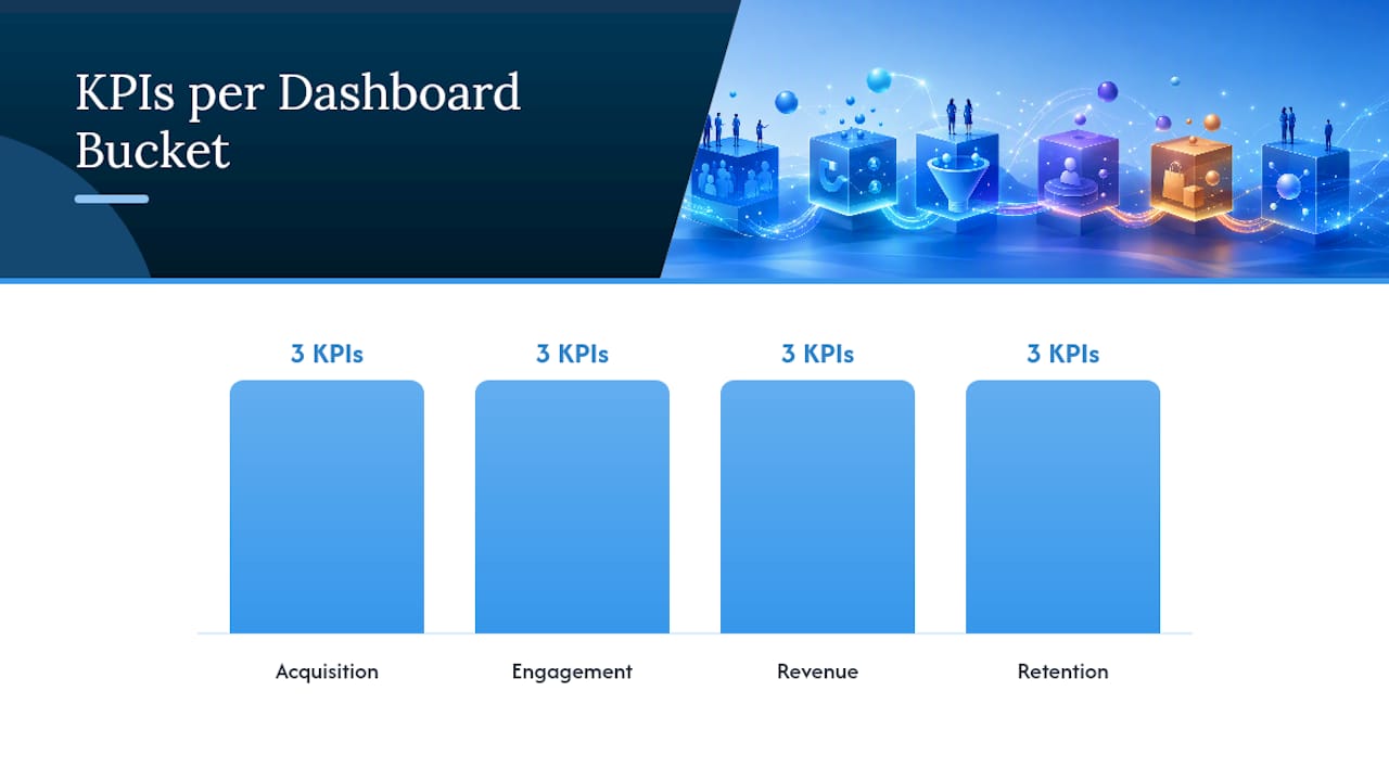
Group these into four buckets so your dashboard tells a story instead of listing numbers:
- Acquisition: CAC, traffic by channel, CTR
- Engagement: email CTR, on-site engagement, session quality
- Revenue contribution: ROAS, AOV, pipeline contribution
- Retention: repeat purchase rate, CLTV, churn
ThoughtSpot’s guidance on structuring KPIs across acquisition, engagement, and revenue backs this exact grouping, and it maps cleanly onto how most marketing teams are already organized by function. That alignment matters more than it sounds. When your dashboard buckets match your org chart, ownership questions answer themselves.
Which KPIs Should You Track for Each Marketing Goal?
Different goals call for different metric sets. Trying to track everything for every goal is how dashboards balloon past 20 tiles and stop getting used.
For growth (new customer acquisition): CAC, conversion rate, AOV, revenue per visitor (RPV). If CAC jumps 20% week over week, that’s your cue to pause the underperforming channel and audit creative and landing pages before spending another dollar.

For performance optimization (existing campaigns): ROAS, CTR, cost per lead, conversion rate by campaign. A CTR drop of 30% on a previously stable ad set usually means creative fatigue, not audience fatigue, so refresh the asset before touching the budget.
For retention and loyalty: repeat purchase rate, CLTV, churn/return rate, email engagement. If repeat purchase rate slides two quarters running, look at post-purchase email cadence and loyalty incentives before assuming it’s a product issue.
For brand awareness: organic traffic, share of voice, branded search volume, engagement rate. These move slower, so judge them monthly, not weekly, or you’ll chase noise.
The goal isn’t more metrics. It’s the smallest set that still tells you what to do next.
How Do You Build a Marketing KPI Dashboard Step by Step?
Building a dashboard people actually open starts with questions, not charts. Here’s the sequence that works:
- Write down five business questions the dashboard must answer. “Are we acquiring customers efficiently?” beats a vague “how’s marketing doing?”
- Pick your North Star metric and tie it to revenue. Every other tile supports this one number.
- Sketch the layout on paper or a whiteboard before opening any tool. North Star at the top, funnel-stage KPIs below it, in the order a viewer’s eye naturally travels.
- Connect your core data sources first: CRM, ad platforms, web analytics, your email or marketing automation platform, and the revenue system (Shopify, Stripe, or your finance tool).
- Automate in order: collection, then metric layer, then refresh and delivery, then alerts. ObserviX’s approach to sequencing automation this way matters because automating a broken data pipeline just multiplies the errors faster.
- Set governance: one glossary, one owner per metric, one review cadence. Daily for ops-level tiles, weekly for tactical checks, monthly for the executive view.
- Ship a version 1 and iterate. A working dashboard with eight metrics beats a “perfect” one still in development three months later.
Pro Tip: Never put raw impressions or pageviews on an executive dashboard. Executives want money and efficiency, not volume. Save the volume metrics for the ops-level view and keep the C-suite tile count under ten.
Build two versions from the start: an ops view (updated daily, funnel-heavy, more tiles) and an exec view (updated weekly or monthly, revenue-heavy, fewer tiles). Trying to serve both audiences with one layout is the fastest way to make a dashboard nobody trusts.
What Are the Formulas Behind Each Core Marketing KPI?
Precise formulas prevent the most common dashboard failure: two teams reporting different numbers under the same metric name.
- CAC = Total acquisition spend ÷ Number of new customers acquired. Pitfall: forgetting to include salaries or tool costs in “spend,” which understates true CAC.
- CLTV = Average order value × Purchase frequency × Average customer lifespan. Pitfall: using a lifespan estimate that’s too short, which deflates the number and makes CAC look worse than it is.
- ROAS = Revenue from ads ÷ Ad spend. ROI = (Revenue − Cost) ÷ Cost. Pitfall: confusing the two; ROAS is a ratio, ROI factors in total cost including non-ad expenses.
- Conversion Rate = Conversions ÷ Total visitors × 100. Pitfall: comparing rates across channels with very different traffic quality without segmenting first.
- Website Traffic by Channel: pulled directly from GA4, segmented by source/medium. Note: GA4 measures “engaged sessions” differently than old-school pageviews, so year-over-year comparisons against pre-GA4 data will look off.
- CTR = Clicks ÷ Impressions × 100. Email CTR = Unique clicks ÷ Emails delivered × 100. Treat email open rates as directional only, since Shopify notes that privacy features on major email clients inflate open counts.
- AOV = Total revenue ÷ Number of orders.
- Cart Abandonment Rate = (Carts created − Completed purchases) ÷ Carts created × 100.
- Pipeline Contribution = Marketing-sourced pipeline value ÷ Total pipeline value.
- MQL-to-SQL Conversion Rate = SQLs ÷ MQLs × 100. Pitfall: this number is meaningless without a shared, documented definition of “qualified” between marketing and sales.
Which Dashboard Tool Fits Your Team and Data?
The right tool depends less on budget and more on how many data sources you’re stitching together and who’s going to look at the output.
- Google Looker Studio is free and connects natively to GA4, Google Ads, and Google Sheets. Best for marketing teams that want a fast, no-cost build without heavy modeling. Setup is simple, but complex joins across non-Google sources get clunky.
- HubSpot works best if your CRM, email, and campaigns already live inside it. Dashboards come pre-built for common marketing views, which shortens setup dramatically for HubSpot-native teams, though it’s less flexible for external data.
- Databox is built specifically for marketers who want pre-made KPI templates without building formulas from scratch. Mid-range cost, strong connector library, and a genuinely fast time to first dashboard.
- Microsoft Power BI suits enterprise teams that need complex data models and scheduled refreshes, with Power BI Desktop as the local build environment before publishing. Setup takes longer and usually benefits from a data analyst on staff.
- Tableau is the enterprise standard for teams with large, varied datasets and a need for advanced visual customization. Powerful, but the learning curve is real, and licensing costs scale with usage.
- GA4 remains the backbone for web engagement and traffic-by-channel data regardless of which BI tool sits on top of it.
- Shopify Analytics is the fastest path to ecommerce-specific numbers like AOV and cart abandonment, and Shopify itself recommends pairing it with GA4 for a fuller picture rather than relying on either alone.
For connectivity, native connectors are more reliable than third-party bridges, but tools like Supermetrics or Funnel earn their cost once you’re pulling from five or more platforms. Bring in a data engineer once refresh errors start outpacing your team’s ability to manually reconcile them.
What Do Real Marketing Dashboard Templates Look Like?
Four dashboard types cover most marketing use cases. Each needs a distinct owner and a distinct tile order.
Campaign performance dashboard (owned by performance marketing): channel ROAS, cost per lead, conversion rate by campaign, spend versus budget, top creative performance, CTR trend, daily spend pacing, and channel-level CAC.

Lead generation dashboard (owned by demand gen): MQLs by source, MQL-to-SQL rate, cost per MQL, form conversion rate, top-performing landing pages, and email nurture engagement.
Ecommerce dashboard (owned by ecommerce/growth): conversion rate, AOV, CAC, cart abandonment rate, revenue by channel, repeat purchase rate, and top product performance.
Executive overview dashboard (owned by CMO): North Star metric, marketing-sourced revenue, blended CAC, LTV/CAC ratio, pipeline coverage percentage, and budget pacing against plan. This is the one dashboard where fewer tiles genuinely means more trust.
How Often Should You Update and Review Marketing KPIs?
Set targets from historical baselines, not gut feel. Pull the last two to four quarters of performance, adjust for known seasonality (holiday spikes, B2B budget cycles), then set both a short-term threshold and a rolling trend line. A single bad week shouldn’t trigger panic; a trend breaking that threshold for three consecutive weeks should.
Useful alert triggers to build in: CAC rising 15% week over week, conversion rate dropping 20% against a 30-day baseline, or email CTR falling below half its trailing average. These thresholds catch real problems without drowning your team in false alarms over normal day-to-day noise.
Cadence should match the metric’s volatility:
- Daily: ops-level tiles like spend pacing and daily conversion rate
- Weekly: tactical checks on channel ROAS, CTR, and CAC
- Monthly: executive reviews of pipeline contribution and blended CAC
- Quarterly: a full review of the KPI set itself, not just the numbers in it
That quarterly review matters more than it gets credit for. Metrics that mattered a year ago sometimes stop reflecting how the business actually makes money, and a dashboard nobody revisits eventually reports on a business that no longer exists.
How Do You Choose the Right KPIs Without Overloading the Dashboard?
Run every candidate metric through this checklist before it earns a tile:
- Does it tie directly to a business question someone will actually ask?
- Does it have a named owner accountable for the number?
- Is the data source confirmed and reliable?
- Is the formula documented in a shared glossary?
- Does it have a review cadence assigned?
- Has it been validated against finance or CRM data at least once?
If a metric fails two or more of these, cut it. Use a simple one-row template for every KPI you keep:
| Metric | Definition | Owner | Cadence | Data Source | Action Trigger |
|---|---|---|---|---|---|
| CAC | Spend ÷ new customers | Performance marketing | Weekly | Ad platforms + CRM | Pause channel if up 15%+ week over week |
Review the full KPI portfolio quarterly. Metrics tied to actual ownership and validated data sources hold up longer than ones added because a platform happened to report them.
Best Practices for Real-Time vs. Periodic KPI Updates
Not every KPI needs a live feed, and treating them all as if they do is a fast way to burn engineering hours on refreshes nobody checks daily. Real-time updates make sense for tiles tied to active decisions: ad spend pacing, daily conversion rate, and cart abandonment during a live promotion all justify hourly or same-day refresh.
Lagging revenue metrics like CLTV or quarterly pipeline contribution don’t need real-time pipes. A weekly or monthly refresh is not only sufficient, it’s often more accurate, since these numbers need time to settle as returns, refunds, and delayed attribution get reconciled.
A useful rule: match refresh frequency to how fast you can actually act on the number. If nobody’s going to change a bid strategy at 2 a.m. based on an hourly CAC swing, that tile doesn’t need hourly data. Real-time dashboards also carry a hidden cost: more moving pipes means more chances for a broken connector to quietly corrupt a number before anyone notices. Reserve real-time refresh for the handful of metrics where speed of detection genuinely changes the outcome, and let everything else run on a periodic, more stable cadence.
What Marketing Teams Get Wrong About Dashboards (and How to Fix It)
The most common mistake is metric overload. Teams pile on 25 tiles because every stakeholder wants their favorite number represented, and the dashboard collapses under its own noise. The fix is brutal simplicity: cap it at 8 to 12 and defend that number in every stakeholder meeting.
The second mistake is missing ownership. A metric with no named owner drifts unmonitored until it’s badly off track. Assign a name to every KPI, not just a team.
The third is a shaky data foundation. No amount of dashboard polish fixes untracked UTMs or a CRM with duplicate records. Fix the pipes before automating anything on top of them.
One pattern shows up repeatedly across client work: teams that consolidate to a single, revenue-denominated North Star metric on their executive view make faster budget decisions than teams tracking a dozen disconnected numbers. Money as the common denominator forces every other metric to prove its relevance.
How Vertical Brands Helps You Build a Dashboard That Actually Gets Used
Most teams don’t struggle to find KPIs. They struggle to connect the data sources, agree on definitions, and keep the dashboard alive after the initial build. That’s the gap Vertical Brands closes.

Vertical Brands works across strategy, creative, performance marketing, and web development under one roof, which means the same team that defines your CAC formula can also fix the tracking gap causing it to be wrong. Services relevant to dashboard work include:
- Marketing strategy and North Star metric definition
- Tracking and attribution setup across CRM, ad platforms, and web analytics
- Dashboard build and governance, including metric glossaries and ownership assignment
- Ongoing optimization once the dashboard is live, not just at launch
If your current dashboard has more tiles than clear owners, request a KPI audit from Vertical Brands and get a straight read on what’s working, what’s noise, and what to fix first.
Recommended Reading on Marketing KPIs and Dashboards
For formulas and ecommerce-specific benchmarks, start with Shopify’s KPI guide and BigCommerce’s ecommerce metrics breakdown. For dashboard build steps and templates, HubSpot’s KPI dashboard guide is the most practical starting point. For governance and executive-level framing, see Sona’s dashboard guide and ObserviX’s build approach. To measure organic contribution beyond raw traffic, this breakdown of conversion-focused SEO metrics is worth a read.
Sources
- Ecommerce metrics and KPIs — BigCommerce
- Marketing dashboard KPIs: definition, examples, and best practices — Sona
Recommended

Other posts




























































Stay ahead with better decisions.
Get business insights today.
